The visual layer is the easy part
A modal is not defined by a dark backdrop and a centered card. It is defined by an interaction contract: the rest of the page becomes unavailable, focus enters the dialog, keyboard navigation stays inside it, and focus returns somewhere intentional when the dialog closes.
As checked on 28 September 2026, the WAI-ARIA Authoring Practices modal dialog pattern describes that contract directly. The HTML Standard supplies a browser-level mechanism for making background content inert. Neither source promises that any component carrying the right role will behave correctly on its own.
This matters because a modal often protects the highest-risk moments in a product: deleting a record, confirming a payment, granting access, or changing an account setting. A component can look finished while sending a keyboard or assistive-technology user into controls behind the overlay.
The practical review is not “does the dialog render?” It is “can a person enter, understand, operate, leave, and continue without losing their place?”
Decide where focus enters
Opening a dialog changes context. Focus should move into it, but “focus the first button” is not a complete rule.
The APG pattern recommends choosing the initial target from the content and consequence of the dialog. If a dialog contains several paragraphs or a structured explanation, focusing a static heading with `tabindex="-1"` can let someone encounter the information before the actions. If the action is difficult to reverse, the least destructive option may be the safer initial target. If the dialog is short and routine, the most likely action can be appropriate.
That choice belongs in the component's API or product acceptance criteria. Leaving it to DOM order means a harmless layout change can alter the interaction. A new close icon inserted above the title may silently become the first stop, even when the person needs to read an error or confirm a consequence.
Test the initial target at the point where the real dialog opens. Component previews are useful, but they do not reproduce the page state, scroll position, validation message, or trigger that exists in production.
Also inspect what is visible after the focus move. Focusing a control near the bottom of a long dialog can scroll the title and context out of view. In that case, a static element near the top is often a better starting point than the first interactive control.
Make the background unavailable, not merely dim
A backdrop changes appearance. It does not necessarily remove background links, buttons, and inputs from keyboard navigation.
The HTML `inert` model makes an element and its flat-tree descendants unavailable for focus, activation, text selection, editing, and accessibility-tree exposure. A native `dialog` opened with `showModal()` participates in the browser's modal-dialog behavior, making the rest of the document inert while the dialog is active.
That is stronger than adding `aria-hidden="true"` to a wrapper. Hiding a region from the accessibility tree does not, by itself, prevent a keyboard from reaching a focusable descendant. It can produce the worse combination: focus moves somewhere that assistive technology no longer exposes.
For a custom dialog implementation, treat background isolation as one behavior to verify, not a pile of attributes to assume. Try Tab and Shift+Tab through the boundaries. Attempt to activate a background control. Check pointer interaction. Inspect the accessibility tree. If the framework provides a mature dialog primitive, prefer it over rebuilding focus containment for each feature.
Do not mark a dialog modal unless it behaves as one. The APG guidance warns that `aria-modal="true"` can make content outside the dialog unavailable to some assistive-technology users. An inaccurate modal claim can therefore hide the escape route while still allowing the application's own focus logic to leak outside.
Treat Tab containment as a state machine
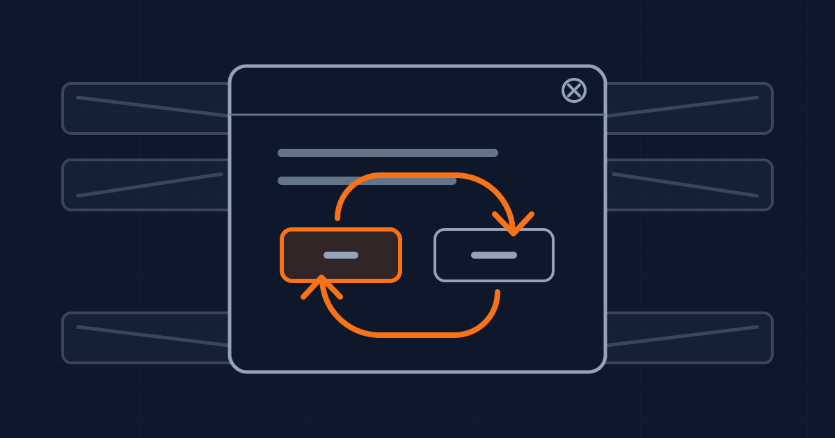
Inside a modal dialog, Tab moves forward through its tabbable controls. From the last one it returns to the first. Shift+Tab performs the reverse transition. Escape closes the dialog when the product allows dismissal.
The difficult cases are not the static ones. Buttons can appear after validation. A destructive action can become disabled during a request. A nested picker can open and close. Content can stream into the dialog. The list of tabbable elements is a runtime state, not a constant captured when the component mounted.
Test containment after each state change the product supports. If a submit button becomes disabled while focus is on it, decide where focus should go and what the user hears. If an error summary appears, decide whether focus moves to it or remains on the field. If a nested modal is unavoidable, verify which layer owns Escape and which layer restores focus.
Avoid positive `tabindex` values as a repair. They create a second navigation order that has to be maintained separately from the visual and DOM order. Fix the structure or component behavior instead.
A small regression matrix is enough to make this repeatable: open with keyboard, traverse forward, traverse backward, trigger validation, close with the visible control, close with Escape when allowed, and repeat at a narrow viewport.
Restore focus to the next useful place
When a dialog closes, the APG pattern normally returns focus to the element that opened it. That preserves the person's location and makes repeated actions predictable.
But the trigger may no longer exist. A row can be deleted, a setup step can complete, or navigation can replace the original screen. Returning focus to a detached element is not a recovery strategy. Letting it fall to the document body is not one either.
Define the fallback from the workflow. After deleting a row, focus may move to the next row or to a stable heading that announces the updated view. After creating an item, the new item may be the logical destination. After completing a multi-step task, the next task control may be more useful than the vanished trigger.
This is why focus restoration cannot live entirely inside a generic dialog. The component can remember its invoker, but the feature owns the meaning of success and knows whether that invoker survives.
Include cancellation and failure in the same contract. Closing without applying a change should usually restore the original trigger. A server error that keeps the dialog open should not send focus back to the page behind it.
Review the assembled product
A reusable dialog component can pass its own tests and still fail after integration. Portals change where the dialog sits in the DOM. Global keyboard shortcuts can intercept Escape. Toasts can steal announcements. A route transition can unmount the trigger before the close callback runs.
Review one real journey for every distinct dialog purpose: information, form entry, confirmation, and destructive action. Record the trigger, initial focus target, forward and reverse boundaries, close methods, restoration target, and behavior after a successful mutation.
Automated tests can assert that focus remains inside the dialog and returns to an expected element. They cannot decide whether the selected element is the most useful place for a person to continue. Keep a short keyboard review in the release evidence for high-impact flows.
What this does not change
A correct focus contract does not establish complete accessibility. The dialog still needs an accessible name, meaningful instructions, readable error handling, sufficient contrast, responsive layout, and testing with relevant assistive technology.
It also does not mean every overlay should become modal. A popover, disclosure, side panel, or inline expansion may preserve context better when the user does not need to stop everything else. Modality is a product decision with interaction costs, not a visual style to apply by default.
The useful standard is narrower: if the interface claims a modal interruption, the background is truly unavailable, focus has an intentional route through the interruption, and closing it returns the user to a place that still makes sense.
Written by Dandelion Labs