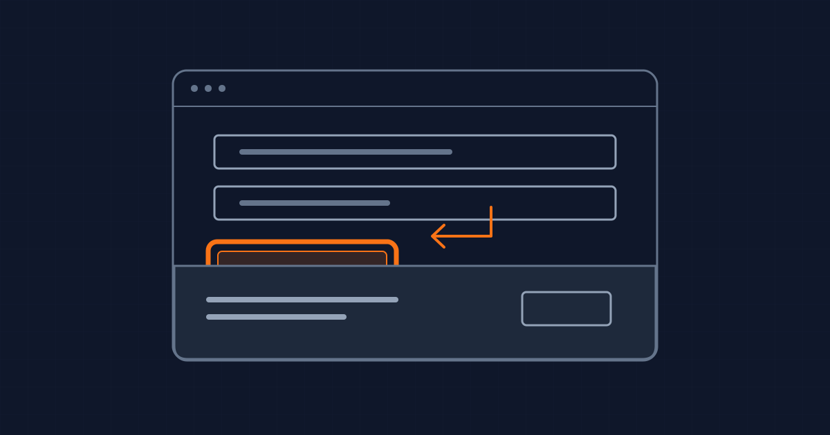
A visible button can disappear when it matters
A sticky footer can hide a button at precisely the moment a keyboard user reaches it. The button still exists, the browser still gives it focus, and the page can look correct in a screenshot taken a moment earlier. The failure is in the transition between states.
As checked on 21 September 2026, WCAG 2.2's Focus Not Obscured (Minimum) addresses that case at Level AA: author-created content must not entirely hide the component receiving keyboard focus. This is an engineering constraint worth testing in a release candidate, even when a team's accessibility work began with colours and labels.
This article proposes a practical review method for product teams. It is not a report of measured conversion gains or a certification of any website. The examples below are hypothetical interface states, chosen because they make the failure easy to reproduce on a disposable preview.
Test a journey, not an isolated component
Consider a checkout form with a fixed order-summary bar. Its payment button passes the component library's visual tests. Its focus outline is present. But the product page also loads a consent banner, and the combination leaves less usable space than either component expected.
The useful test starts before either overlay is dismissed. Move through the actual journey using the keyboard. Record which control receives focus, what covers it, and what action reveals it. Repeat while moving backwards. A layout that works only in the forward direction still leaves someone unable to review a previous answer.
Keep a state inventory with the feature: consent undecided, validation error visible, help panel expanded and confirmation dialog open. These are suggested test cases, not assumptions that every product contains all those controls. Select the states the application really supports. Each should have an owner and an expected keyboard path.
A screenshot belongs beside the sequence that produced it. Without that sequence, a reviewer cannot tell whether the element was focused, merely hovered, or visible only after someone used a mouse to move the page. Reproduction steps turn a design complaint into a fixable defect.
Separate the outline from the thing it identifies
Focus Visible concerns the visible indication of keyboard focus. Focus Not Obscured concerns the component itself. They are related but answer different questions. A carefully styled outline cannot rescue a control hidden beneath another panel.
Use that distinction in review comments. “The ring needs more contrast” asks for a styling change. “The active field is under the footer” asks for a layout or scrolling change. Combining them into “accessibility issue” makes it easy to fix the wrong thing and close the ticket.
The minimum obscuration criterion allows partial visibility. The enhanced Level AAA criterion goes further and requires the focused component to remain unobscured. A team can choose the stronger product behaviour without claiming that every other AAA requirement has been satisfied. Record the chosen acceptance condition explicitly.
Give scrolling the space the interface consumes
W3C's C43 technique illustrates using padding and scroll padding to keep focused content clear of a fixed banner. It also changes the layout at smaller sizes instead of preserving a fixed overlay at any cost. That is a useful reminder: fixing a panel in place is a design choice, not a requirement of the browser.
For a product implementation, first identify the element that actually scrolls. A dashboard may scroll a central panel while its surrounding document stays still. Applying an offset to the wrong container can leave the original overlap intact. Inspect the assembled screen rather than copying a declaration into the global stylesheet and assuming it worked.
Then account for changing content. A translated banner may wrap; an error message may make a footer taller; a user may enlarge text. Reserve space based on the real layout, or let the obstructing component return to normal flow when the usable area becomes too small. Treat those as alternatives to evaluate, not a universal recipe.
After changing the layout, repeat the same keyboard sequence. Also inspect what happens when the overlay closes. Space that remains reserved after its owner disappears can create a second defect. The regression should cover both presence and removal, because both states ship to readers.
A modal is a commitment about interaction
Making an overlay modal can prevent keyboard users from wandering behind it, but only when it behaves as a modal. The ARIA Authoring Practices dialog pattern describes moving focus inside, containing the tab sequence, closing with Escape and handling focus when the dialog closes.
Do not select modality merely because it makes one overlap test pass. Ask whether the task genuinely requires the user to finish or dismiss the panel before continuing. An optional help panel and a destructive-action confirmation have different purposes. An unnecessary interruption may solve the geometry while making the workflow harder to use.
Reuse the application's established dialog component where possible. Review the point where it is opened and the destination when it closes, as well as the dialog itself. If the original trigger has disappeared after a successful operation, the interface needs an intentional next destination. Leaving that decision to accidental document order is fragile.
Make the release evidence small and repeatable
For each important journey, retain the route, browser and viewport, the starting state, the keyboard sequence and the observed result. Include the actual build identifier. A passing check against last week's preview does not establish the behaviour of the version being released today.
Assign the defect to the component or integration that owns the obstruction. If several teams can independently add fixed banners, a shared layout contract is more useful than repeatedly increasing offsets on individual forms. The contract should say which regions may overlap, which must displace content and how their occupied space is communicated.
Automation can help preserve a reproduced regression, but the team still needs to inspect the result. A script confirming that an element exists or has focus does not by itself establish that a person can see it. Keep the assertion tied to the actual failure being prevented.
What this does not change
This review covers a narrow part of keyboard usability. It does not establish meaningful focus order, correct accessible names, complete screen-reader behaviour or overall WCAG conformance. The linked techniques are implementation guidance; they are not a substitute for evaluating all applicable requirements.
It also makes no claim about how much revenue a focus fix recovers. The immediate evidence is simpler: a person can locate the control they are about to operate, in a state the product actually supports. That is a concrete release property an engineering team can reproduce and maintain.
Written by Dandelion Labs